
From Beige to Bold: Interior Paint Color Trends to Watch in 2026
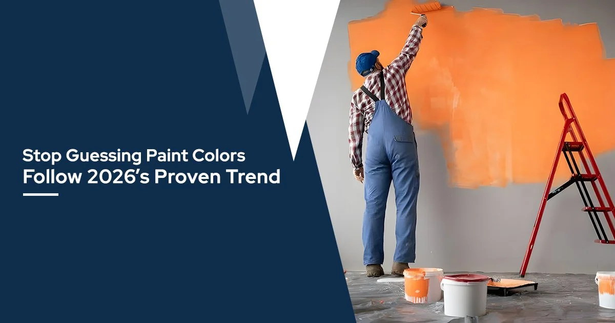
Every fall, the big paint companies announce their color of the year. Sherwin-Williams picks one. Benjamin Moore picks another. Behr, Valspar, Pantone — they all weigh in. Design magazines run features. Instagram explodes.
Then you stand in the paint aisle staring at 4,000 swatches and none of it helps.
Here's what's different about 2026: for the first time in years, the brands actually agree. Not on one specific shade — but on a direction. The era of cool grays is over. Interior paint colors 2026 are warmer, earthier, and richer than anything we've seen in the last decade.
The shift is toward colors that feel grounded. Colors that make a room feel lived-in instead of staged. And the good news is, whether you're painting one accent wall or a whole house, these tones are forgiving, versatile, and genuinely easy to live with.
At Hall Brothers Lumber, we've been helping Missouri homeowners pick the right paint for 87 years. Our paint department carries the brands making these calls. Here's what they chose, what it means, and how to actually use it.
What Did the Major Paint Brands Pick for 2026?
The 2026 color of the year selections from Sherwin-Williams Universal Khaki, Benjamin Moore Silhouette, Behr Hidden Gem, and Valspar Warm Eucalyptus all point in the same direction — warm paint colors, rich browns, and nature-inspired greens that prioritize comfort and grounding over trendiness.
Here's the lineup:
| Brand | Color of the Year | What It Looks Like |
|---|---|---|
| Sherwin-Williams | Universal Khaki SW 6150 | Warm sandy neutral with subtle green undertone — between beige and taupe |
| Benjamin Moore | Silhouette AF-655 | Rich espresso blended with charcoal — deep, luxurious brown |
| Behr | Hidden Gem | Smoky jade — a calming blue-green with depth |
| Valspar | Warm Eucalyptus | Green with warm undertones — nature-inspired, grounding |
| Pantone | Cloud Dancer | Soft billowy white — a "whisper of serenity" |
| Graham & Brown | Divine Damson | Luxurious plum-purple with red undertones |
| Clark + Kensington | Hazelnut Crunch | Earthy reddish-brown — warm and cocooning |
The pattern is impossible to miss. Warm paint colors, earthy greens, grounding neutrals. Even Behr's jade and Graham & Brown's plum fit the theme — they're jewel tones, but muted and sophisticated rather than bright.
Sue Wadden, Sherwin-Williams' director of color marketing, called Universal Khaki "a timeless, go-anywhere shade that brings grounded elegance to any space." Benjamin Moore described Silhouette as inspired by "the resurgence of timeless pieces and the growing interest in the brown color family."
Translation: the pendulum swung. Cool grays are done. Warm is back.
Why Did Every Brand Move Toward Warm and Earthy?
The industry-wide shift toward warm paint colors in paint trends 2026 reflects a cultural desire for comfort and permanence — homeowners are choosing colors that feel calming rather than trendy, that work with natural materials, and that don't demand repainting every two years when the next trend arrives.
For the last decade, the dominant color story was some variation of gray. Agreeable Gray. Repose Gray. Gray everything. It looked clean. It photographed well. And eventually, it made every room feel like a hotel lobby.
The 2026 palette is a reaction to that. These colors have warmth. They have personality. A wall painted in Benjamin Moore Silhouette doesn't look like a backdrop — it looks intentional. A room in Sherwin-Williams Universal Khaki feels like someone actually lives there.
The practical upside: warm paint colors pair naturally with wood, leather, stone, and greenery — materials that most Missouri homes already have. You don't need to buy new furniture to make a warm wall work. Your existing oak floors, wood trim, and leather couch were waiting for this moment.
Check our home trends page for more on how these color shifts connect to broader design directions in cabinets, countertops, and finishes.
How Do You Actually Use These Colors in a Room?
Start with one wall or one feature — a front door, an accent wall, a built-in bookcase — and observe it in your own lighting for a few days before committing to a full room. Best wall colors 2026 behave differently in north-facing rooms versus south-facing, morning light versus evening lamps.
Here's a practical breakdown by color category:
For the warm neutrals (Universal Khaki, Hazelnut Crunch): These are whole-room colors. They work on every wall without overwhelming. Universal Khaki in particular is forgiving — it leans golden in south-facing light and slightly greener in north-facing rooms, but it stays balanced either way. Use it in living rooms, hallways, or bedrooms where you want warmth without drama.
For the deep browns (Benjamin Moore Silhouette): This is a feature color, not a four-wall color (unless your room has generous natural light). Paint it on an accent wall behind a bed, on kitchen cabinets, or on built-in shelving. Pair it with white or cream trim for contrast. It looks exceptional on doors and trim as an alternative to black.
For the jewel greens (Behr Hidden Gem, Warm Eucalyptus): Start with a powder room, a mudroom, or a home office. These tones make smaller rooms feel intentional rather than cramped. They pair beautifully with brass hardware, warm wood, and white fixtures. If you love the result, scale up to a larger room.
For the bold accent (Divine Damson): Plum is not for everyone. But in a dining room with candlelight or a moody powder room, it's stunning. Start with the smallest room in your house. If it feels right, you'll know.
What's the Smartest Way to Test Before You Commit?
Buy peel-and-stick samples or small sample pots and apply large swatches directly on the wall you're considering — then live with them for at least 48 hours, observing in morning light, afternoon sun, and evening lamp light, before making a final decision on your best wall colors 2026.
Color on a two-inch chip looks nothing like color on a wall. The only way to know is to see it in your space, in your light, at the actual scale.
Most major paint brands now sell peel-and-stick samples you can move around the room. Benjamin Moore, Sherwin-Williams, and Behr all offer them for a few dollars. Apply them on the wall you're considering — not just the brightest wall, but the one that gets the least light too.
Watch it for two days. Notice how it shifts from morning to evening. Check it with overhead lights on and off. If it still feels right on day two, it's the right color.
One more thing: always test next to your existing trim and flooring. A warm wall against cool white trim creates a beautiful contrast. A warm wall against yellowed trim looks muddy. Knowing this before you buy five gallons saves money and frustration.
Our team at Hall Brothers can mix custom samples in-store and help you narrow options before you buy. That's what a local paint counter is for.
Does Paint Quality Actually Matter?
Yes — premium paint typically covers in fewer coats, adheres better, resists fading and scuffing longer, and ultimately costs less per year of use than budget paint that needs repainting sooner — especially important with the deeper interior paint colors 2026 selections.
A gallon of good paint costs more upfront. But if it covers in two coats instead of three, you're buying less paint, spending less time, and getting a smoother finish. Over five years, the premium paint that held up without touch-ups was cheaper than the bargain paint you had to redo.
This matters especially with the deeper paint trends 2026 colors. Dark browns, jades, and plums are unforgiving — cheap paint shows brush marks, roller lines, and uneven coverage. Quality paint with good pigment density covers evenly on the first pass.
Proper prep matters too: clean the wall, fill nail holes, lightly sand glossy surfaces, and prime if you're covering a dramatically different color. A well-prepped wall makes even average paint look better — and makes good paint look flawless.
Frequently Asked Questions
What is the most popular paint color for 2026?
Sherwin-Williams Universal Khaki is the most broadly usable 2026 color of the year — a warm, mid-tone neutral that works in virtually any room and any lighting condition. Benjamin Moore Silhouette is the most talked-about for its richness and sophistication, but it's a feature color rather than a whole-home neutral. For maximum versatility, warm paint colors like Universal Khaki or Valspar's Warm Eucalyptus are the safest starting points.
Are gray walls out of style in 2026?
Cool grays have fallen out of favor in paint trends 2026, but a warm gray (greige) is still a solid neutral. The shift is away from stark, blue-undertone grays and toward warmer tones with brown, green, or taupe undertones. If you currently have gray walls, you don't need to panic — but if you're repainting, the interior paint colors 2026 palette leans decisively warmer.
Can I use a dark color like Benjamin Moore Silhouette in a small room?
Yes — Benjamin Moore Silhouette and other dark best wall colors 2026 can actually make small rooms feel more intimate and intentional rather than cramped, especially in powder rooms, home offices, and dining rooms. The key is lighting: make sure the room has adequate lamp light or natural light, and use lighter trim and fixtures to create contrast. Dark colors absorb light, so rooms with no windows or very low ceilings may feel closed in without supplemental lighting.
How do I pick between so many color-of-the-year options?
Ignore the marketing and focus on one question: what undertone does your room need when choosing from interior paint colors 2026? Rooms with warm wood floors and trim want warm paint colors (Universal Khaki, Silhouette, Hazelnut Crunch). Rooms with cool-toned tile or gray flooring work better with cooler selections (Hidden Gem, Warm Eucalyptus). Start with undertone, narrow to shade, then test in your specific light.
How many coats of paint do I need for a dark color?
Most dark interior paint colors 2026 require two coats minimum over a tinted primer for even coverage. Skipping primer when going dark is the most common DIY mistake — it leads to blotchy coverage and more coats, which costs more in paint and time. Use a primer tinted close to your final color (your paint counter can do this), then apply two even coats of your finish color.
Can Hall Brothers help me choose a paint color?
Yes — our paint counter staff can walk you through the paint trends 2026 palettes, mix custom samples, and recommend the right paint type (flat, eggshell, satin, semi-gloss) for your specific project. Bring a photo of your room and a note about which direction the windows face — that helps us recommend interior paint colors 2026 that will look right in your light. We carry paint from multiple brands so you're not locked into one palette.
Paint is the fastest, cheapest, most reversible way to change how your home feels. A weekend and a few gallons can make a room you've been ignoring into the room you can't leave.
The 2026 color of the year picks make that easier than usual. The brands agree: warm, grounded, real. Not trendy — timeless. That's a rare alignment, and it means whatever you pick from this year's best wall colors 2026 has staying power.
At Hall Brothers Lumber, we've been helping Missouri homeowners make these decisions for 87 years. Whether you need paint matched to a swatch, advice on primer, or just someone to talk through options with, our team is here.
Hall Brothers Lumber
New Haven, MO
Phone: (636) 583-2114
Contact us
hallbroslumber.com
Serving Missouri homeowners for 87 years.