
Interior Paint Trends 2026: Warm Neutrals and Gradient Colors
Interior Paint Color Trends 2026
Thinking about giving a room a fresh new look? 2026 is bringing some fun paint color trends that can update your home’s style. Instead of sticking with plain white or beige, many people are choosing warmer neutrals and pops of color to make spaces feel cozy and current. Let’s look at what colors are in style this year and how you can use them in your own home.
Popular Color Themes for 2026
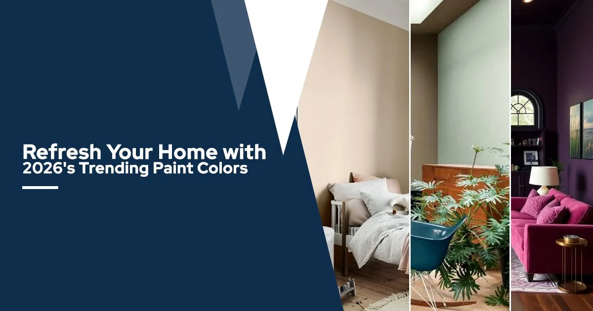
- Warm Neutrals: Creamy off-whites, soft beiges or greige (gray-beige) are very popular. These gentle warm neutrals are great for walls in living rooms, kitchens or bedrooms. They create a cozy, inviting backdrop that goes with most furniture and decor. (Think of a light oatmeal or a soft sandstone tone instead of a bright white wall.)
- Earthy Greens and Browns: Natural colors like sage green, olive or muted terracotta are on trend. These nature-inspired shades bring a calm, organic feel. For example, a light sage green on one wall can make a dining room feel fresh and relaxed, or a soft brownish-tan can add warmth to a bedroom.
- Deep Accent Shades: Rich, deeper colors are often used as accents. Navy blue, charcoal gray, or deep rust (burnt orange) look striking on a single wall, kitchen island, or built-in bookshelf while the rest of the room stays neutral. A dark accent wall can add character and contrast without overwhelming the whole space. For instance, painting one wall in deep slate blue makes the pieces of art or white trim pop.
How to Use Trendy Colors in Your Home
Choosing a trendy color doesn’t mean you have to repaint every wall. In fact, a smart approach is to paint most walls in a warm neutral and use the bolder color on just one feature. For example, keep three walls a light cream and paint the fourth wall (or a built-in cabinet) in that rich accent shade. This way the project stays efficient (you need less paint and it’s quicker to do) and if you change your mind later, you only touch up one area. Using color accents also lets you experiment — if the deep navy or rust feels too intense on all walls, it’s easy to repaint a single wall later.
Quality of paint can make your work easier too. A good paint that covers well often means you can get away with one coat after priming, especially if you’re switching from a light color to a slightly darker or different hue. Spending a bit more on a higher-quality paint can save time (fewer coats needed) and reduce leftover paint. Just be sure to clean and prime any bare or patched walls first so the new color goes on smoothly and shows its true shade.
Another way to save time is to plan the project in stages. Maybe start with the room that needs it most, or begin with the accent wall only.
Painting a smaller area first (like a hallway or bathroom accent wall) lets you see how the color feels without committing to a whole house. This step-by-step approach spreads out the work and cost, and it cuts the risk of major mistakes.
Tips for Choosing the Right Shade
- Test on Your Walls: Always paint several square feet of sample color on the actual wall (in small patches) and look at it at different times of day. A color can look one way in the store or in a small chip, and look very different under your room’s lighting. Seeing the paint on your wall in morning light and at night under lamps will help you pick the right shade with confidence.
- Consider Your Light: Note how much natural light the room gets. South-facing rooms with lots of sunlight can handle stronger colors (they will look a bit lighter in daylight), while north-facing or dim rooms might make dark paints look even darker. If a room has little light, a warm neutral or a medium tone is often safer than a deep color.
- Use Accent Elements: If a bright or bold color feels like too much, try using it on something smaller – like trim, a bookshelf, or even furniture. For example, paint a bookshelf the accent color or add an accent stripe on one wall. It gives you that trendy color without committing every wall to it.
- Match Your Decor: Think about your existing furniture and floors. A warm tan wall goes well with wood floors or wicker furniture, while a sage green pairs nicely with plants or neutral fabrics. Make sure the trending color plays well with what you already have so you don’t need to replace everything at once.
- Bring in Inspiration: Found a color you love in a magazine or online photo? Many paint stores offer color matching. You can bring in a photo cutout or even a fabric swatch, and they can mix your paint to match it exactly. That way you get the trendy shade you want without any guessing.
Putting these ideas together can help make your painting project smooth and successful. Remember, trends are there to inspire you, but the best color is one that makes you feel happy in your space. Even if a certain shade is “in”, it should still work with your decor and style.
We hope you found these 2026 color ideas helpful for your next home update.
For more paint tips and design ideas, follow our page. Feel free to message us if you want to talk through your color options or test out a sample. Happy painting!