
From Beige to Bold: Top Interior Paint Colors for 2026
What Is a Warm Minimalist Color Scheme?
A warm minimalist palette strips a room down to its essentials — but replaces stark, cold whites with colors rooted in nature. Think mushroom, clay, warm taupe, greige, and soft terracotta. The result is a space that feels both clean and livable. In 2026, this is exactly where home design is heading. Sherwin-Williams named Universal Khaki their Color of the Year. Benjamin Moore went with Silhouette AF-655. The broader trend across major paint brands points to one direction: grounded, organic warmth over clinical minimalism.
This guide helps you build that palette with confidence — understanding why certain colors work in certain rooms, not just what colors are trending.
The 60-30-10 Rule: Your Palette Foundation
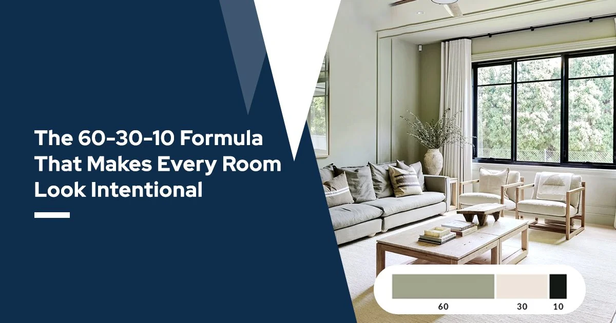
Every warm minimalist scheme needs structure. The industry-standard framework is 60-30-10:
- 60% — Your dominant neutral (walls, large surfaces). Examples: warm taupe, greige, mushroom, soft clay.
- 30% — Your secondary tone (furniture, cabinetry, larger textiles). Examples: warm white, natural linen, soft sage.
- 10% — Your accent (cushions, a feature wall, trim details). Examples: deep terracotta, burnt ochre, mossy green.
This ratio prevents the space from feeling either too flat (all one tone) or too busy (competing colors). Minimalism here isn't about absence — it's about intentional restraint.
Understanding Undertones: The Most Overlooked Step
Most homeowners pick a color they love on a chip — then hate it on the wall. The reason is almost always undertones.
Warm neutrals carry hidden secondary hues. A beige can lean pink, yellow, or orange depending on its base pigment. A greige can lean purple or green. When your undertone clashes with your flooring or furniture, even a "safe" neutral looks off.
The fix: always pull your palette from what's already fixed in the room — your floors, your largest furniture piece, your natural wood tones. Hall Brothers' in-store color matching service lets you bring in an actual sample of your flooring, cabinetry, or a fabric swatch, and match your paint undertone to it precisely. This eliminates guesswork.
LRV: Choosing the Right Shade for Your Room's Light
LRV — Light Reflectance Value — measures how much light a paint color reflects, on a scale of 0 (pure black) to 100 (pure white). This number determines whether a warm neutral will feel airy or cave-like in your specific room.
Here's a practical framework:
- LRV 60–80 — Best for low-light rooms (north-facing, small bedrooms, hallways). Keeps the space from feeling heavy. Example range: warm creams, soft mushroom tones.
- LRV 40–60 — Works well in rooms with good natural light. Adds depth without darkening. Example range: warm taupe, clay, greige.
- LRV below 40 — Reserve for accent walls or rooms with large windows. Deep terracotta or warm espresso at this range creates drama, but needs light to balance it.
A warm neutral with an LRV under 50 in a north-facing room will read darker and moodier than the chip suggests. This is one of the most common mistakes homeowners make — and one of the easiest to avoid with the right guidance.
2026's Best Warm Minimalist Palettes
Based on current design trends, here are three palette directions worth considering:
Palette 1 — Organic Quiet
Walls in mushroom or warm greige (LRV 55–65) + natural oak or walnut furniture + a single deep olive green accent. Feels serene, sophisticated, and timeless. Works especially well in living rooms and primary bedrooms.
Palette 2 — Clay & Cream
Walls in soft warm white or linen (LRV 70–80) + terracotta or burnt clay accents on one wall or in textiles + raw wood details. Feels warm without being heavy. Ideal for smaller spaces or rooms with limited natural light.
Palette 3 — Earthy Depth
Walls in warm taupe or sandstone beige (LRV 45–55) + cognac leather or deep brown furniture + a mossy green or ochre accent. Feels grounded and rich. Best suited to living rooms with good window light or spaces where you want an enveloping, cozy atmosphere.
Matching Your Palette to Your Room's Function
Color doesn't just affect aesthetics — it affects how you feel in a space. Warm neutrals with lower LRV values (more absorbed light) promote calm and help the mind slow down, making them ideal for bedrooms. Higher LRV warm tones keep energy up without introducing harshness, making them better for kitchens or home offices. A home office painted in warm mushroom at LRV 60 will feel focused and calm — significantly less distracting than a bright white or a stimulating saturated color.
What to Bring to Hall Brothers
When you're ready to move from inspiration to execution, bring the following to our Hall Brothers store in Franklin County:
- A photo of your room in natural daylight
- A sample of your flooring material (or a photo showing its tone clearly)
- The largest fixed furniture piece's color (or a fabric swatch)
- Any inspiration images you've saved
The team can help you narrow your palette using color matching, recommend the right finish for each surface (matte for walls, eggshell for high-traffic areas, semi-gloss for trim), and ensure your undertones are working together — not against each other.
Hall Brothers has been helping Franklin County families build and finish their homes since 1938. Three generations of hands-on expertise means you're not getting generic advice — you're getting guidance from people who know how materials, light, and color interact in real homes.
The Bottom Line
A warm minimalist color scheme works because of the relationships between colors — not just the individual shades. Get your undertones aligned, match your LRV to your room's light, follow the 60-30-10 structure, and let one accent color do the expressive work. The result is a space that feels intentional, inviting, and entirely your own.
Stop by Hall Brothers Lumber in Franklin County or contact us to get started on your palette.
Frequently Asked Questions
Q: What is the difference between warm minimalism and regular minimalism?
Traditional minimalism leans on stark whites, cool grays, and an almost clinical absence of color. Warm minimalism keeps the clean, uncluttered structure but replaces those cold tones with nature-rooted neutrals — mushroom, clay, warm taupe, greige. The goal is a space that feels intentional and livable, not just empty.
Q: How many colors should a warm minimalist palette have?
Three is the sweet spot. One dominant neutral for your walls (60%), one secondary tone for furniture or larger surfaces (30%), and one accent color for details and focal points (10%). More than three colors and the "minimalist" part starts to break down.
Q: How do I know if a warm neutral will look good in my specific room?
Check the LRV (Light Reflectance Value) of the color before committing. Low-light or north-facing rooms need a warm neutral with an LRV of 60 or above to avoid feeling dark and heavy. Rooms with strong natural light can handle LRV values in the 40–60 range without losing their brightness. Always test a sample patch on your actual wall and observe it at different times of day — morning light and evening lamp light will show you completely different results.
Q: Why does my warm neutral paint look different on the wall than on the chip?
Two reasons. First, the chip is tiny — color appears darker and more saturated on a large wall surface. Second, undertones become more visible at scale. A beige with a pink undertone is barely noticeable on a chip but very obvious across an entire room. This is why matching your paint's undertone to your fixed elements (floors, furniture) matters so much before you buy a full can.
Q: Can I use a warm minimalist palette in a small room?
Yes — and it often works better than stark white. A warm neutral with an LRV of 65–75 reflects plenty of light while adding depth that makes a small room feel considered rather than just cramped. Avoid going too dark (LRV below 45) in a small space unless you have strong natural light sources.
Q: What accent colors work best with warm neutrals in 2026?
The strongest pairings right now are deep terracotta, mossy green, burnt ochre, and warm olive. These accent tones are trending precisely because they feel grounded and natural alongside mushroom, greige, and clay bases. Avoid cool-toned accents like bright blue or purple — they fight the warmth of your neutral base instead of complementing it.
Q: Can Hall Brothers help me choose the right palette for my home?
Yes. Bring a photo of your room, a sample of your flooring or a fabric swatch from your largest furniture piece, and any inspiration images you have. The team at Hall Brothers in Franklin County can color-match to your existing materials, recommend the right LRV range for your room's light conditions, and help you land on a palette that works — not just one that looks good on a screen.